
Your hero section is the first thing a visitor sees, and research shows people judge a website in under 50 milliseconds. If that top strip does not say what you offer, who it is for, and why you are worth their time, most visitors leave before they ever scroll. This guide breaks down the anatomy of a hero section that converts, gives you a clarity checklist, and shows what to put above the fold for different kinds of SME websites.
What a hero section is and why the first seconds decide
A hero section is the top area of a page that a visitor sees before scrolling, usually a headline, a short supporting line, one clear action, and a visual. It is the digital version of a shop window on a busy street. On most SME websites it is the homepage header and the top of every landing page, the one area that is guaranteed to be seen.
Two numbers explain why it matters so much. First, a Google research team found that users form a gut feeling about a site in 17 to 50 milliseconds, faster than a single blink (100 to 400 milliseconds). That snap judgment is driven by two factors: visual complexity (how busy the design looks) and prototypicality (how familiar it looks for its category). People most prefer designs that are both simple and familiar, so a clean, expected layout earns trust before a word is read.
Second, attention stays near the top. In Nielsen Norman Group eye tracking, visitors spent 57% of their viewing time above the fold and 74% within the first two screenfuls. More than 42% of all attention landed in the top 20% of the page. People do scroll when given a reason, but they rarely go past the third screenful.
So the hero section is where you spend the attention you are most likely to get. Waste it, and the rest of the page may never be seen. In other words, the hero section is your pitch, your proof, and your front door compressed into a single screen, so every element has to earn its place.
The anatomy of a hero section that converts
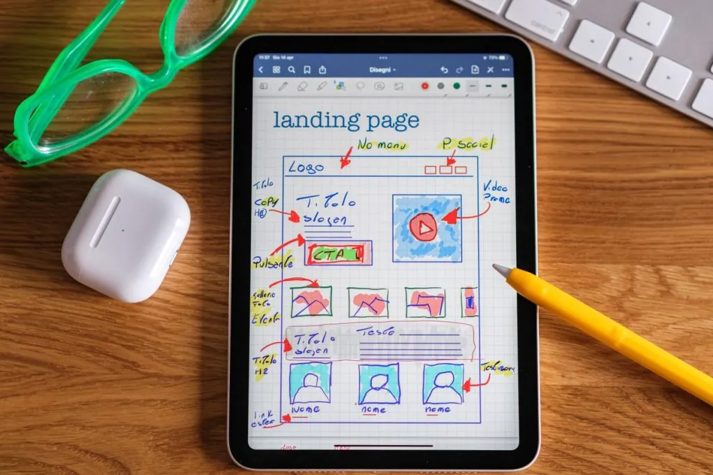
A strong hero section is not about a big picture. It is about answering four questions fast. Those questions are simple but unforgiving: what is this, who is it for, why should I trust you, and what do I do next. Here is the anatomy we use at Webie when we design a homepage or a landing page:
| Element | Its job | Common mistake |
|---|---|---|
| Headline | Say what you do and the result, in the customer’s words | A vague slogan nobody searches for |
| Subheadline | Add who it is for and the main proof or benefit | Repeating the headline |
| Primary action | One clear next step with an action verb | Two or three competing buttons |
| Hero visual | Show the real product, result, or people | A generic stock photo |
| Trust signal | Reduce risk with a rating, logo, or number | Nothing, so the visitor hesitates |
| Scroll cue | Hint that there is more below | A false floor that looks like the end |
Keep one primary action. A quieter secondary link (for example “See our work”) is fine, but competing buttons split the decision.
Checklist: nail the message in 5 seconds
Before a hero section goes live, run the 5 second test: show it to someone for five seconds, hide it, then ask what the business does and what they should do next. If they cannot answer, the hero fails. Use this checklist:
- Does the headline name the outcome, not just the service?
- Can a first time visitor tell who it is for?
- Is there exactly one obvious primary action?
- Does the visual support the message instead of decorating it?
- Is at least one trust signal in view?
- On a phone, do the headline and action appear without scrolling?
- Does the text read clearly on both light and dark backgrounds?
Recently I reworked the hero section for an ecommerce shop. The old banner just showed products in general and did nothing to push the key items the shop wanted to promote. So I changed the angle: instead of simply displaying products, I made the hero speak to what the customer needed at that moment. It was late in the year and winter was coming, so people wanted warm clothing. I put the winter range, like boots, right at the top with a message tied to the cold season. The clearest result was that more visitors went on to browse the winter products than before. The lesson, and the most common hero mistake I see on Vietnamese SME sites, is that owners keep showing off their products but forget to speak to what the customer actually needs. When the hero matches a real need, that is when people stop and click.
What to put above the fold, by SME type
The right hero content depends on how people buy from you. Use this as a starting map:
| Business type | Lead with | Primary action |
|---|---|---|
| Dental or health clinic | Trust and easy booking | Book an appointment |
| Real estate | The property promise and location value | View listings or Register interest |
| Restaurant or F&B | Atmosphere and the signature offer | View menu or Reserve a table |
| Online shop | A best seller or current offer with clear pricing | Shop now |
| Professional services | The outcome and the proof | Get a free consultation |
The pattern is always the same: lead with what the visitor cares about most, back it with proof, and make the next step obvious. Match the promise in the hero to the keyword or the ad that brought the visitor there, so the message feels continuous from click to page.
Common hero section mistakes to avoid
- Auto rotating sliders: they move before people read, lower click rates, and slow the page down. One strong static hero usually wins.
- Vague headlines: “Welcome to our website” or “Quality you can trust” say nothing. Name the result.
- Stock photo clutter: generic images lower trust. Real photos of your work or team perform better.
- A hidden or weak action: if the main button blends into the background, visitors do not act.
- Oversized hero media: a full screen image that pushes all the text below the fold wastes your best space, especially on mobile.
- Ignoring mobile: more than half of Vietnamese web traffic is on phones, so the hero must work in a narrow, vertical view first.
- False floors: a hero that looks finished makes people stop scrolling. Add a cue that content continues.
Frequently asked questions
Does a hero section need a big image?
No. A clear headline, one action, and trust matter more than the picture. Many high converting heroes use a simple background or a small, relevant image so the message stays readable and the page loads fast.
Should I use a slider or carousel in the hero?
Usually not. Rotating banners move before visitors finish reading, split attention across several messages, and tend to lower clicks. One focused hero with a single message and action performs better in most cases.
How is a hero section different on mobile?
On a phone the viewport is narrow and tall, so the headline and primary action must be visible without scrolling, the visual often moves below or behind the text, and tap targets need enough size and spacing. Design the mobile hero first, then expand to desktop.
Your hero section is the hardest working strip of your website. If your homepage is not turning visitors into enquiries, the first screen is the place to start. At Webie we design websites that say the right thing in the first few seconds and guide visitors to act. See our web design services, or talk to us: hotline +84 969 838 467, email huyen.dang@webie.com.vn.